

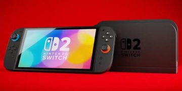


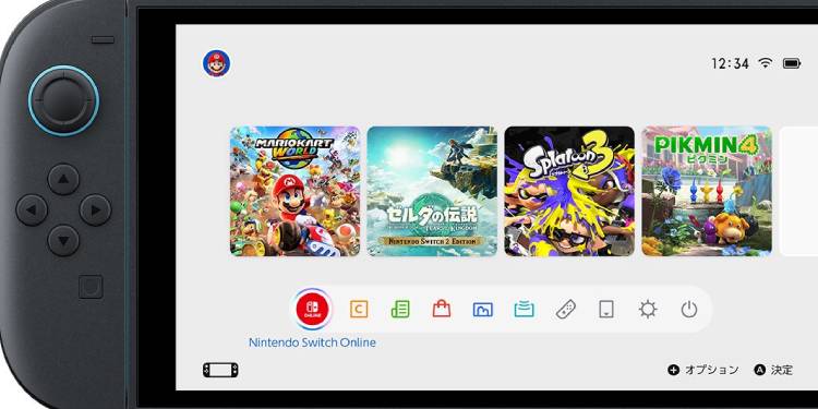
The upcoming Nintendo Switch 2 raises an interesting question: what kind of user interface will this new console feature? Will it closely resemble the original Switch, or will it offer a completely redesigned experience? Based on what has been officially revealed on Nintendo’s website, we can already see some noticeable UI changes.


One of the most significant updates appears in the design of the Nintendo eShop. The new layout feels more modern and elegant compared to the original Switch, offering a cleaner and more refined look. However, the home screen interface hasn’t changed drastically. It still retains a familiar layout, with only slight modifications—such as more precise square shapes, improved highlight colors when navigating menus, and updated icons that are likely to be well-received by users, according to a recent analysis by Witchihare, a site dedicated to gaming news and trends.


It remains uncertain whether Nintendo will introduce more customizable themes or stick with the default ones like Basic White and Basic Black, which were the only options on the original Switch.
Nonetheless, the navigation experience within the new eShop marks a clear improvement. It feels more like a true digital storefront, making it a more convenient and user-friendly platform for purchasing games than its predecessor.


